The Brief.
We wanted to create a clear, confident, playful and lasting brand identity that tells a story through our work. We worked with our partners in open-communication to draw out the best results for our brand.
The Design.
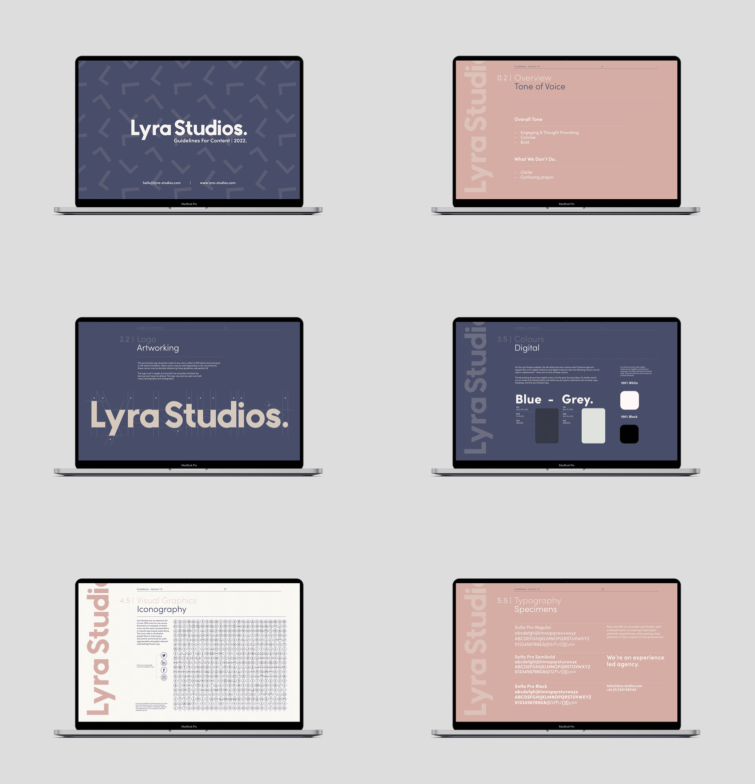
Our brand guidelines were created from the ground up. Starting with the name, then logo design, colour palette, typography, tone of voice, our story, brand strategy, playful graphic elements and digital assets. This methodical creative process gave us a guiding base to work from and sets out clear principles and instructions for the communication of the brand.

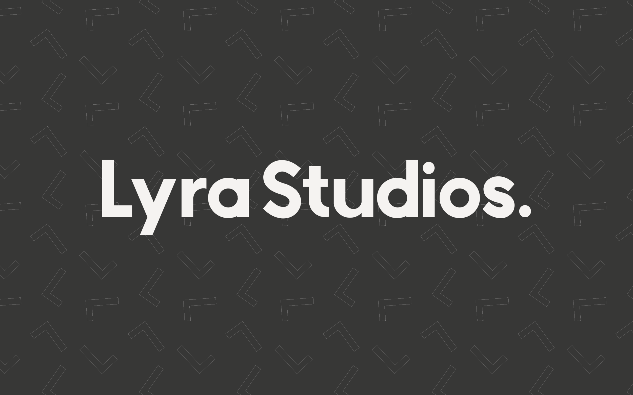
We developed two playful graphic narratives incorporated across our digital and print assets to compliment the typography, logo and colour system.

Our Process
At Lyra Studios, we work through a three-phase methodology when producing a brand identity. We start with the brand fundamentals including logo, colour palette, fonts and graphic elements. We then tailor our approach to best suit our client's needs and the brand strategy, this could incorporate UX/UI, illustrations, motion, social content, and print media. Below is a sample of this process.
Logo Iterations
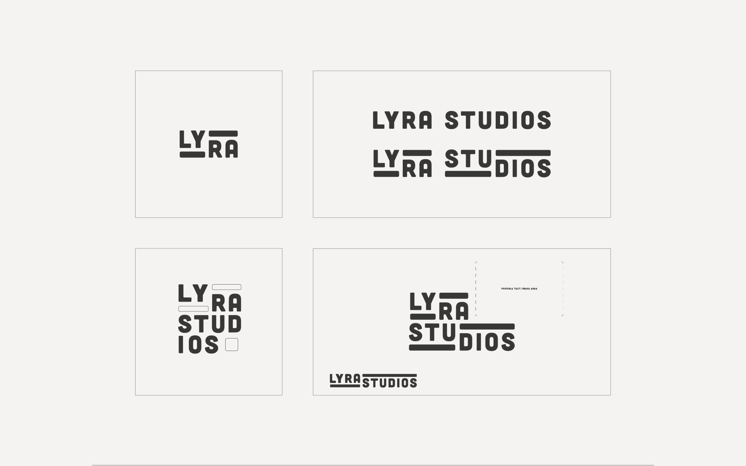
Good logos do two things, they provide meaning and distinguish a brand. We explored multiple iterations and development phases before reaching our final logo. The logo needed to be strong and clear with a fitting narrative at its heart.
Graphic Elements
Similar to the logo phases we explored the same design process to produce two graphic systems to complement the brand identity. Our finalised patterns are both expressive and playful.
Ready to kick-start your project.
We'd love to chat about how we can help. Whether you have a concrete plan or a budding idea, book a discovery call with our co-founder, Will.


